How Can a Crochet App Foster Community and Learning?

Tools: Figma • Notion

Skills: UX Research • Product Design • Branding • Prototyping

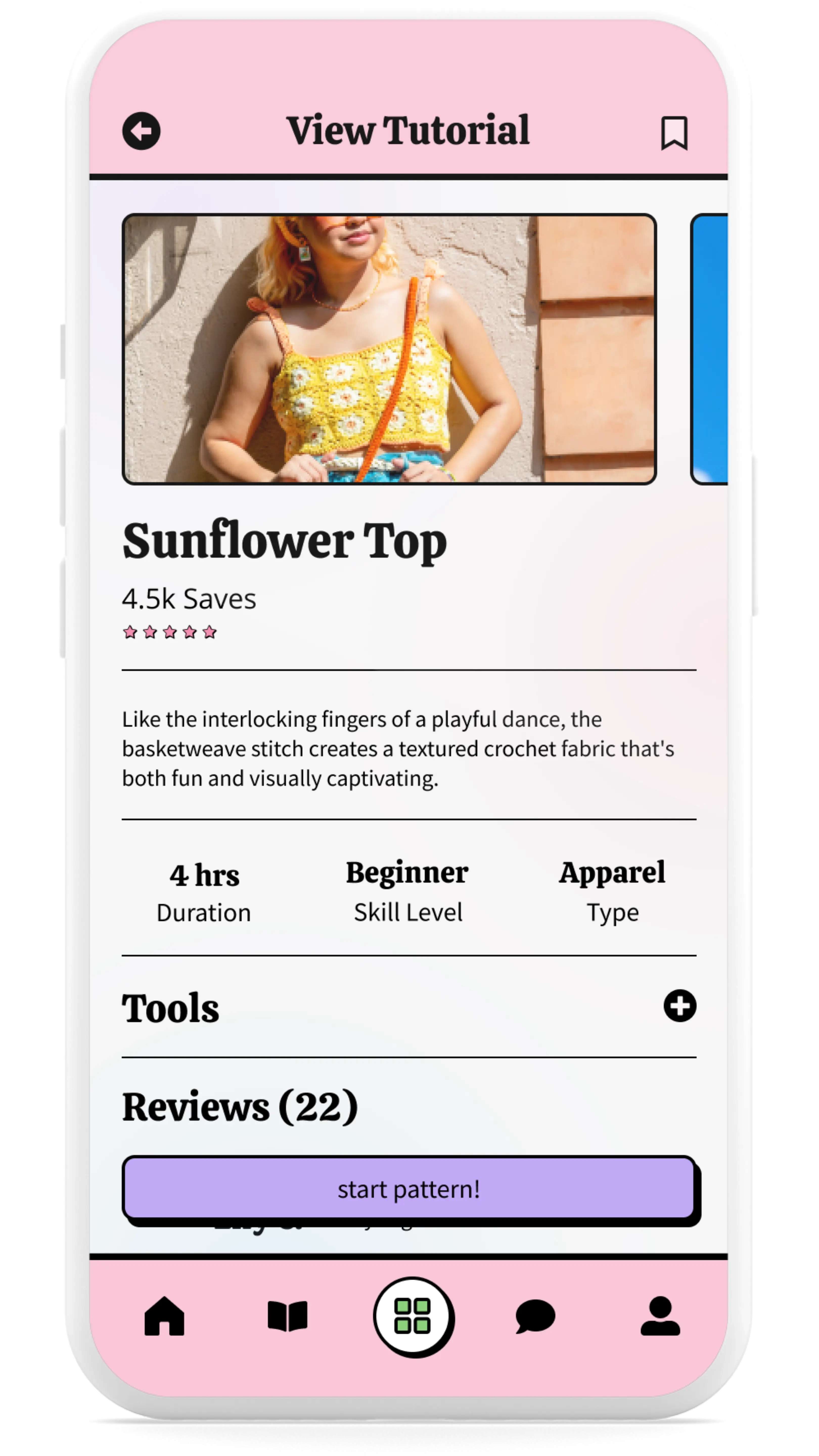
Mobile app screen displaying a tutorial for a crochet project titled 'Sunflower Top,' with an image of a woman wearing a crocheted top, details such as duration, skill level, and type, and buttons to start the pattern or view tools and reviews.
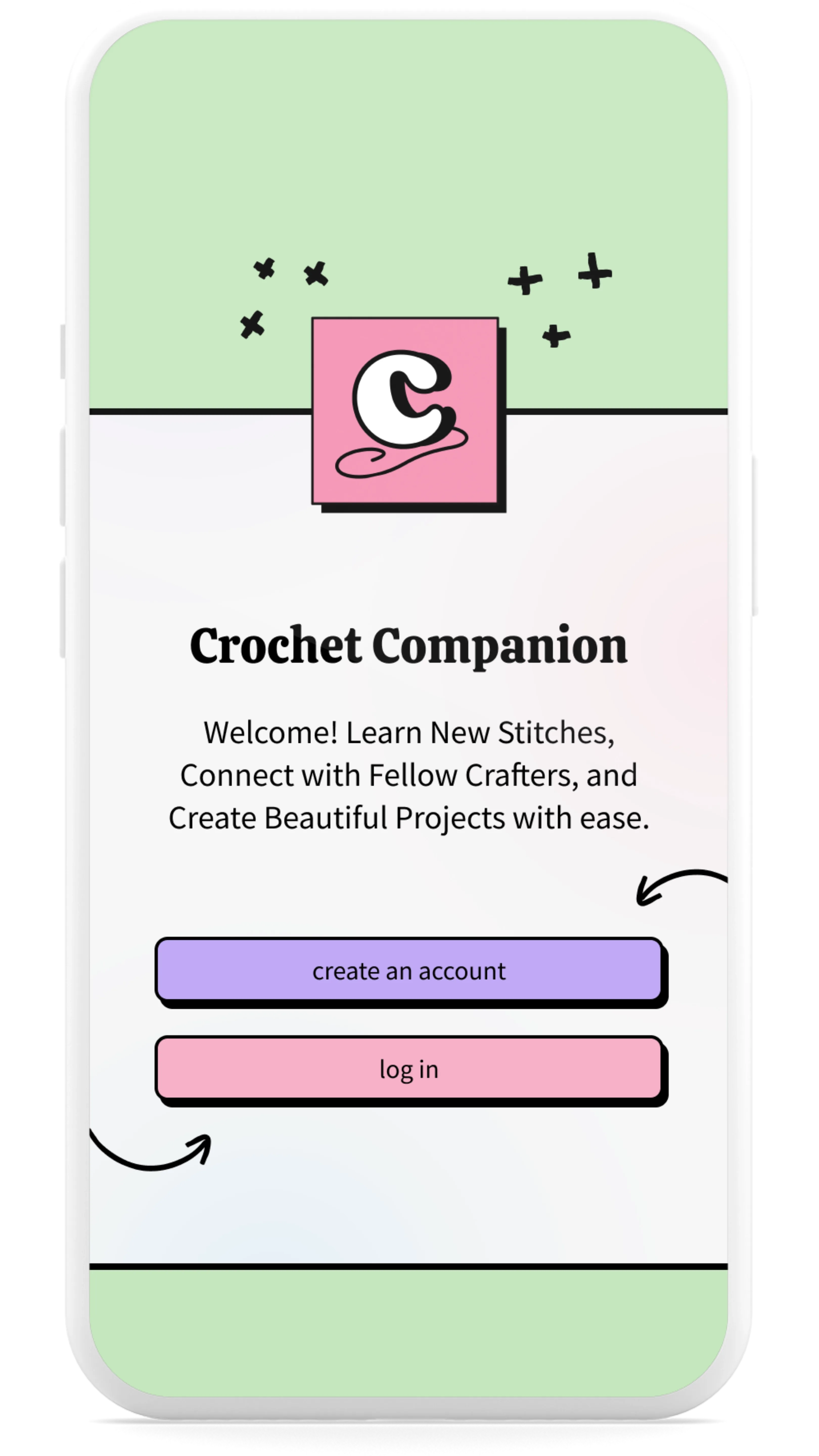
Mobile app welcome screen titled 'Crochet Companion,' featuring a pastel green and pink background, a playful logo, and buttons for creating an account or logging in.
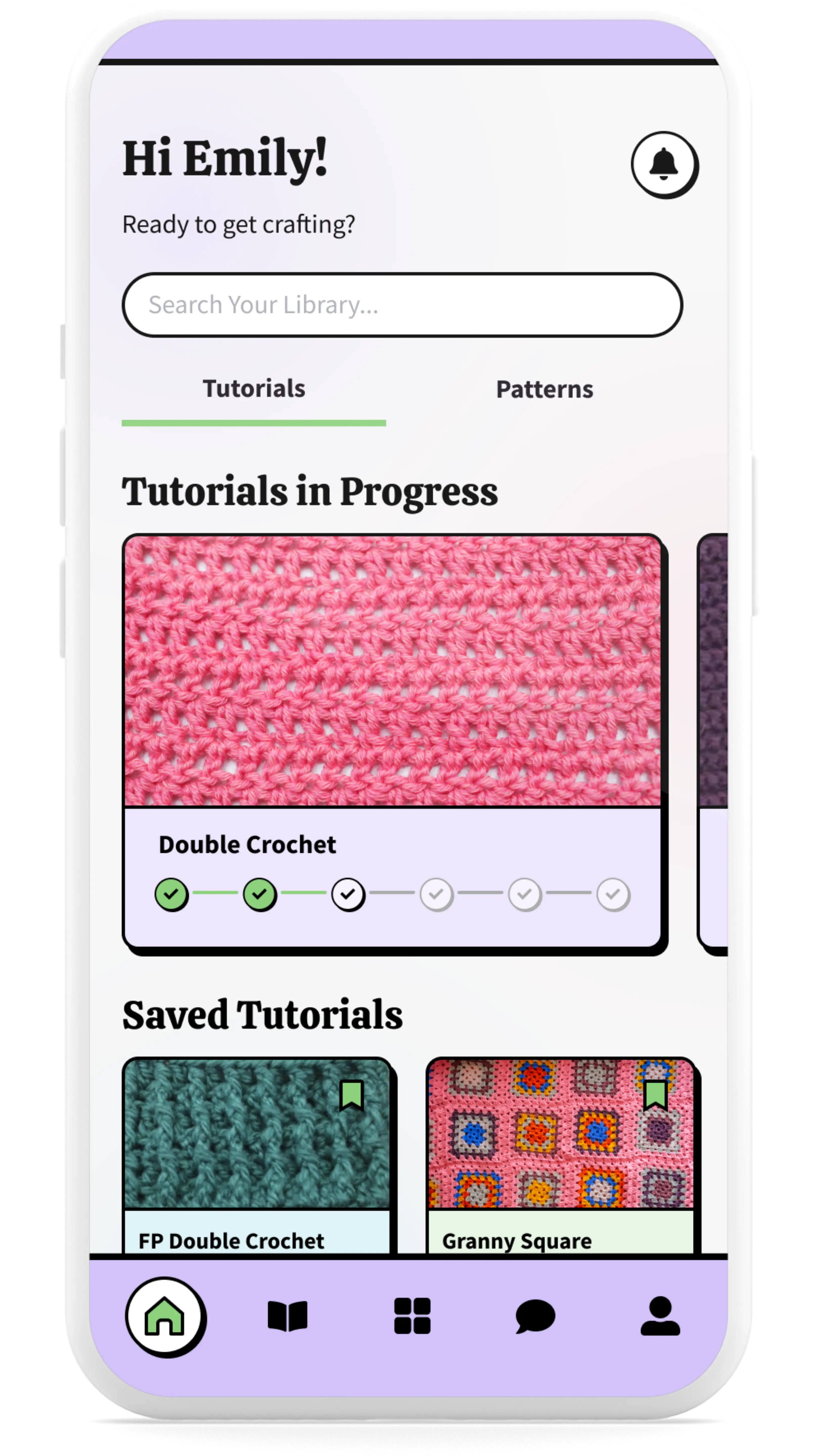
Mobile app dashboard with the greeting 'Hi Emily!' and options to search, view tutorials in progress, saved tutorials, and patterns. Includes colorful thumbnails of crochet projects like 'Double Crochet' and 'Granny Square.'

Note: For confidentiality purposes, all industry details, company names, brand names, and store names have been intentionally disguised. All visuals used are mockups and do not represent actual company assets. This case study focuses on the process, challenges, and outcomes of the project while respecting proprietary and protected information.

Overview

As a passionate crocheter who’s also left-handed, I’ve always struggled to find tutorials and resources that truly meet my needs. It was frustrating seeing a lack of crochet platforms that combine education, patterns, and community. That’s when I decided to take matters into my own hands. I wanted to create something something that would make the crochet experience easier and more enjoyable for everyone. Combining my love for crochet with my background in product design, I created a design for an all-in-one hub for crochet enthusiasts called Crochet Companion.

Research + Exploration

My first step in creating the Crochet Companion app was to dive into research. I started by analyzing existing platforms and apps, identifying their strengths and weaknesses through a competitive analysis. Next, I surveyed passionate crocheters to better understand their needs and challenges. To wrap it up, I conducted market research to spot emerging trends and focused on UX design to make sure the app would be both intuitive and enjoyable to use.

Competitive Analysis

By analyzing popular crochet platforms known for their resources, features, and design, I gathered valuable insights to begin the creation of my app. I took inspiration from their strengths while addressing their weaknesses, with the goal of creating a unique, user-centered experience. I aimed to combine the best aspects of these platforms while adding my own touch. With a focus on user satisfaction, easy navigation, and building community, I wanted to give crochet enthusiasts an app that truly serves as their perfect crochet companion.

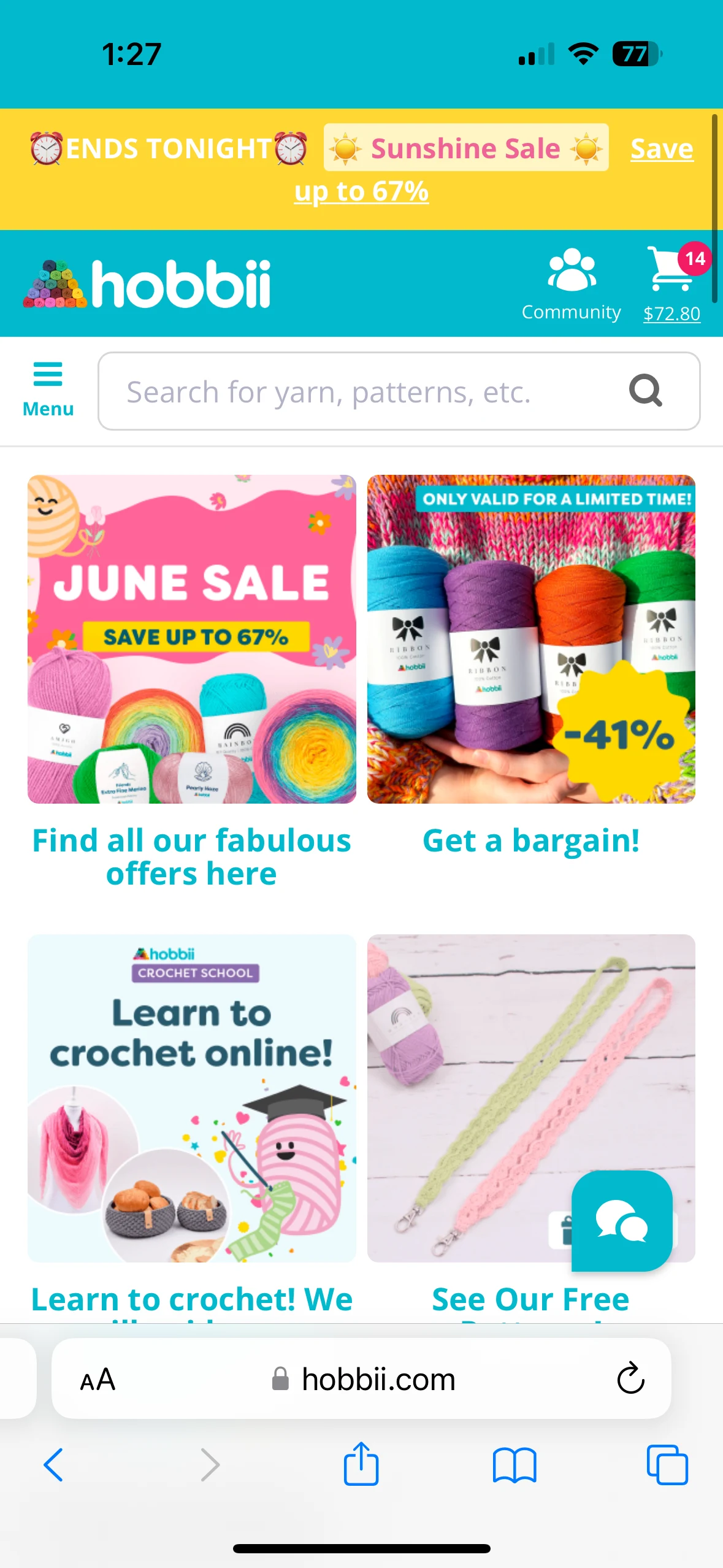
Mobile app screen showing the Hobbii interface with a search bar for yarn and patterns, promotional banners for a June Sale, and options for learning to crochet online.
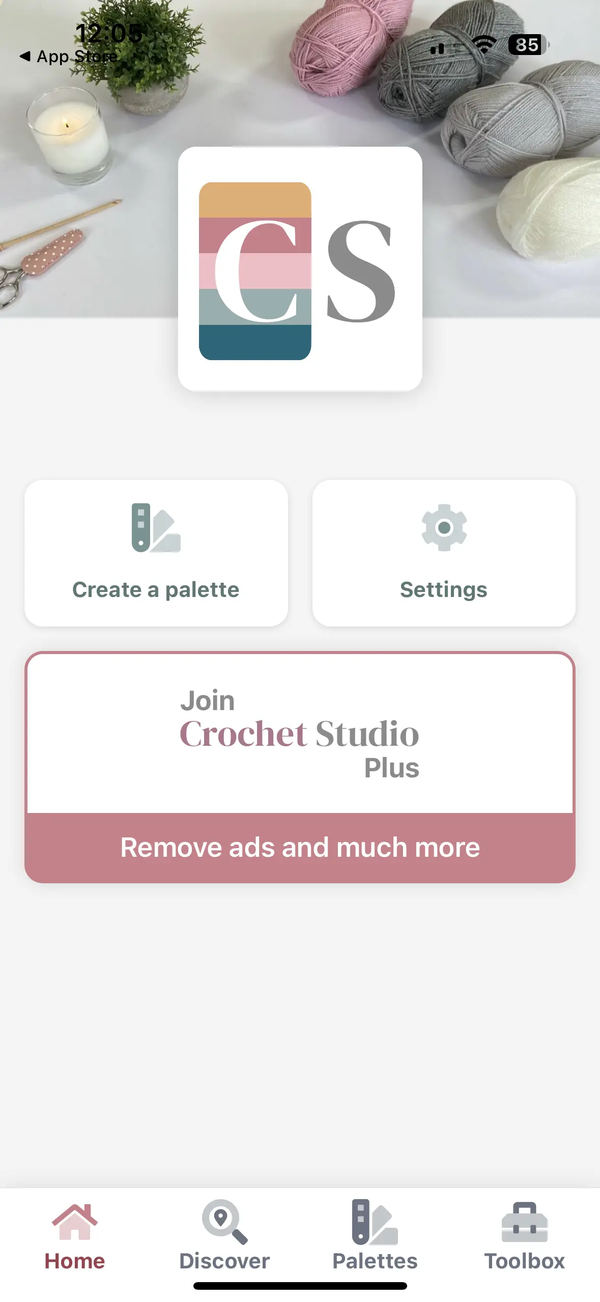
Mobile app screen displaying the Crochet Studio dashboard, featuring a logo at the top, buttons for creating a palette, accessing settings, and a prompt to join Crochet Studio Plus to remove ads.
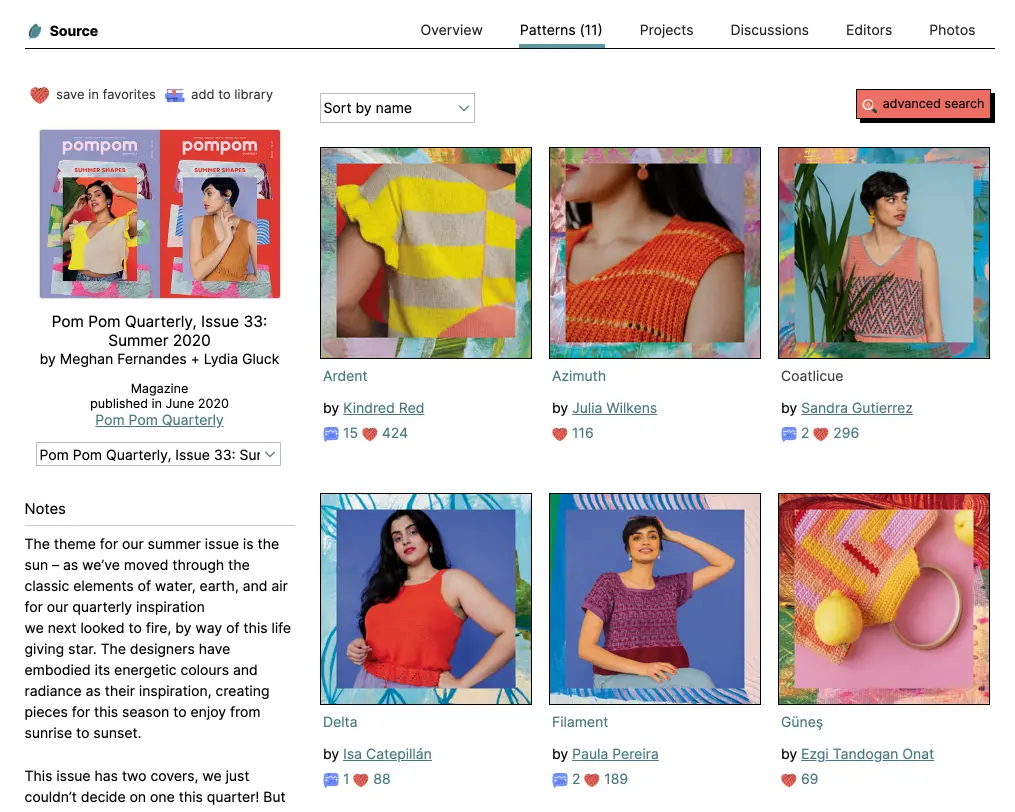
Desktop interface showcasing a patterns overview, including Pom Pom Quarterly magazine covers and a grid of colorful crochet patterns with project names, designers, and engagement stats like favorites and comments.

Screenshots from apps and websites utilized in my competitive analysis

Survey

I ran a survey with 44 respondents (a big thanks to the /crochet community on Reddit for helping out!). The goal was to gather insights on everything from demographics and crochet experience to how people use apps, what they like in terms of community and social interaction, and even their buying habits and supply preferences. Talking directly with crochet enthusiasts gave me a deeper understanding of what they truly need, and that feedback played a huge role in shaping the design and features of my app.

Below are some of the survey answers. You can view all of the survey answers here.

How do you learn new crochet techniques?

Written tutorials (9.1%)

Video tutorials (25%)

Combination of both (65.9%)

Types of crochet projects worked on

Other (18.2%)

Clothing (65.9%)

Accessories (65.9%)

Amigurumi/Toys (72.7%)

Home Decor (81.8%)

How long have you been crocheting?

Less than 1 year (11.4%)

3-5 years (18.2%)

1-3 years (20.5%)

5+ years (50%)

"There are a million row counter apps, we need more stitch libraries and tutorials!"

UX Research

I took a lot of inspiration from key UX trends to make sure the app would meet the needs of users. Personalization was a big focus of mine, letting users adjust their individual experience. Bold visuals and happy, vibrant colors help create an engaging atmosphere, and the use of cards keeps content organized and easy to access. I also embraced emotional design principles to ensure the app brings positive feelings and delivers a delightful experience.

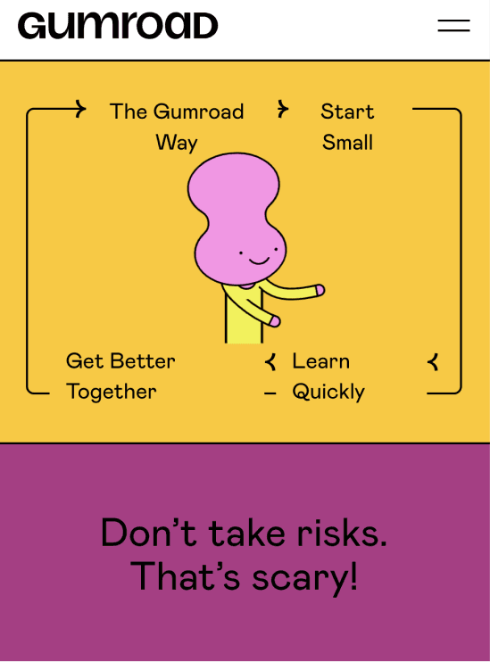
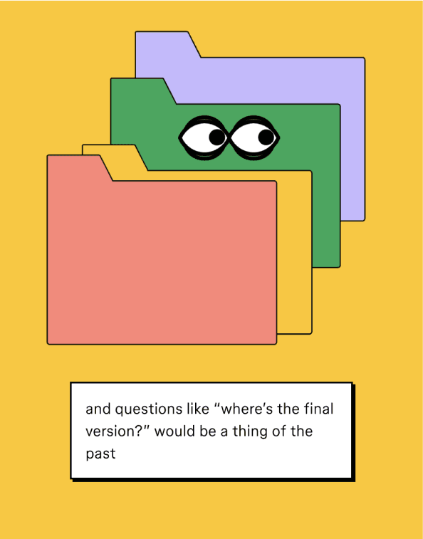
The main design trend I leaned into was Neubrutalism. It fits perfectly with the creative and playful spirit of the crochet community. By incorporating this trend, my app offers a bold, modern interface that stands out and really connects with users.

Gumroad interface featuring a yellow background with a quirky pink character and text highlighting steps like 'The Gumroad Way,' 'Start Small,' 'Learn Quickly,' and 'Get Better Together.' A purple section below reads 'Don't take risks. That's scary!'
Illustration of colorful file folders with cartoon eyes on one, set against a yellow background. A caption below reads 'and questions like “where’s the final version?” would be a thing of the past.'

Examples from Neubrutalism in design (featuring the Gumroad website and Figma)

Define

During the defining phase of my app development, I took all the insights from my research and organized them using an affinity map. I also created personas to represent different types of users. With a clear picture of who the users were, I developed user stories and mapped out the user journey.

Affinity Map

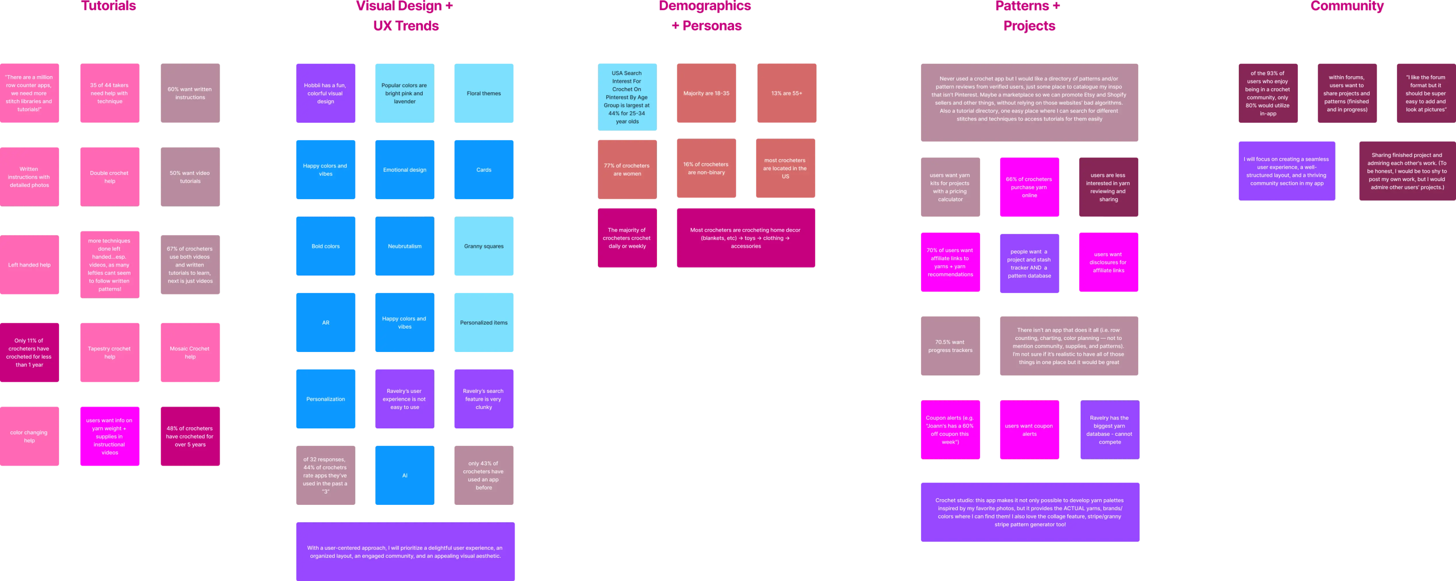
By analyzing the information I gathered, I identified key areas that shaped the direction of my app. These included the demand for high-quality tutorials, the importance of current UX trends and appealing design, understanding diverse demographics through personas, offering a variety of patterns and projects, and building a vibrant, supportive community.

Affinity map showcasing categorized insights from research on a crochet-focused app. The categories include Tutorials, Visual Design + UX Trends, Demographics + Personas, Patterns + Projects, and Community. Each section contains color-coded sticky notes summarizing findings, such as user preferences, trends, and pain points, organized for clarity and analysis.

The affinity map used to create patterns and define my research

Personas

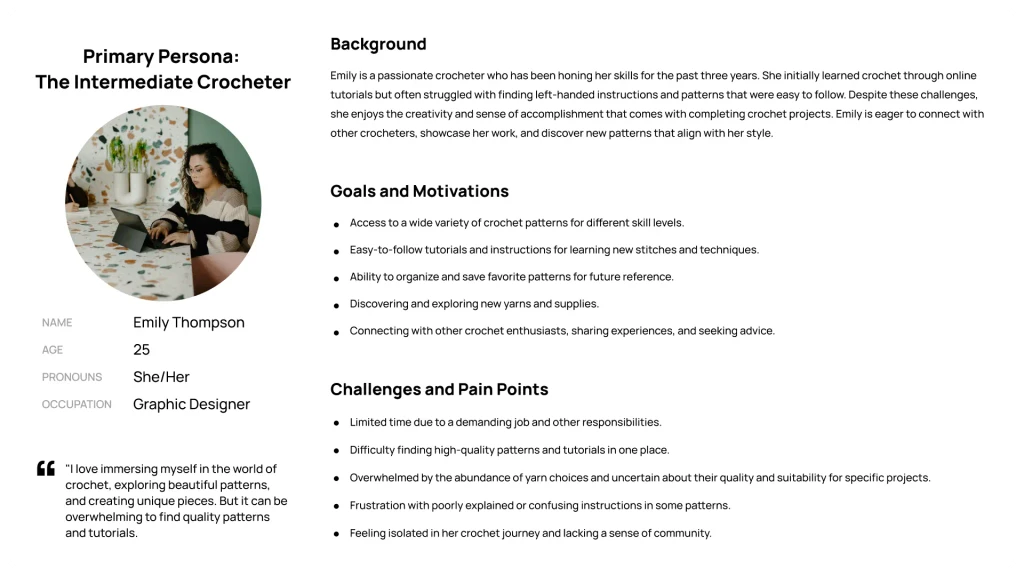
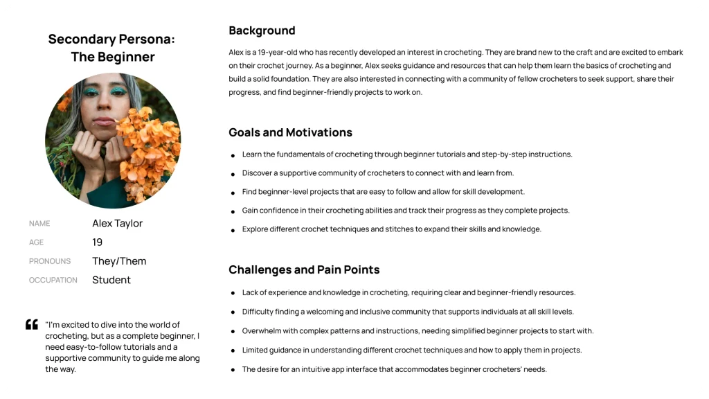
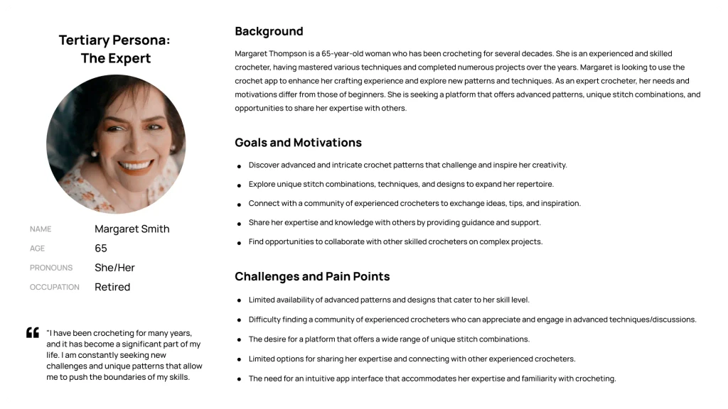
As part of the defining process, I created three personas—primary, secondary, and tertiary—to better understand my target users. These personas helped me identify the unique needs, preferences, and goals of different user groups.
Primary Persona: 'The Intermediate Crocheter,' Emily Thompson, a 25-year-old graphic designer passionate about honing her crochet skills and connecting with other crafters.
Secondary Persona: 'The Beginner,' Alex Taylor, a 19-year-old student eager to explore the basics of crochet and build confidence with tutorials.
Tertiary Persona: 'The Expert,' Margaret Smith, a 65-year-old retired crocheter looking for advanced patterns, techniques, and opportunities to share expertise with others.

Screenshots of the three personas created

User Stories + User Journey

I created user stories and mapped out a user journey for my app. The user stories helped me define the tasks and goals of my users, and gather insights from their needs and expectations. This allowed me to visualize how users would interact with the app, helping me spot potential pain points and areas for improvement. I focused specifically on crafting a journey for my primary persona, Emily, imagining her experience as a first-time user. I considered her actions, thoughts, and feelings to make sure the flow felt intuitive and engaging. By putting myself in Emily’s shoes, I identified key moments that needed attention to ensure a smooth experience from the moment she opens the app.

User journey map divided into key stages: Registration, Onboarding, Exploring, Tutorials, Patterns, Community, and Profile. Each stage includes detailed rows for actions, touchpoints, customer thoughts, customer feelings (depicted with emojis), and opportunities for improvement. The map uses color-coded sections and sticky notes to represent user experiences and potential design solutions.

A screenshot from the comprehensive user journey for my primary persona, Emily

Information Architecture + Design

With a clear understanding of user needs and the vision for my app, I moved on to the next phase of designing the framework and look for the Crochet Companion app. This involved creating a flowchart, designing wireframes, developing the branding, and prototyping the app.

Flowchart

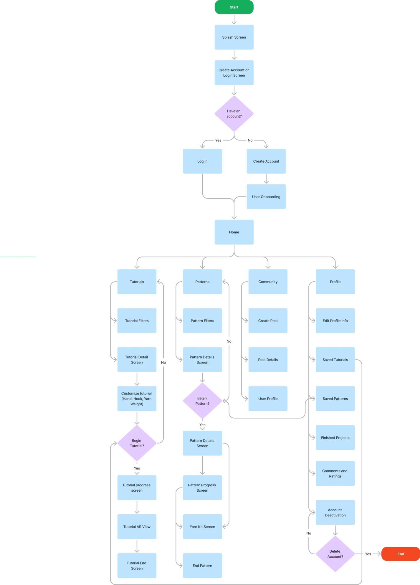
For a smooth user experience, I started by creating a flowchart that outlined the app’s process. This flowchart mapped out the user’s journey, showing the various screens, interactions, and transitions they’d encounter. By planning each step, I wanted to simplify navigation and help users easily complete tasks like registration, accessing tutorials, exploring patterns, and engaging with the community. The flowchart acted as a roadmap, guiding the next stages of development and design.

Flowchart illustrating the user journey for a crochet app, starting from the splash screen and proceeding through account creation or login. Key branches include accessing the home screen, tutorials, patterns, community, and profile sections. The flow highlights actions like filtering tutorials, customizing patterns, creating posts, saving projects, and managing account settings, with clear decision points and end states.

A screen capture of the app's flowchart

Wireframes

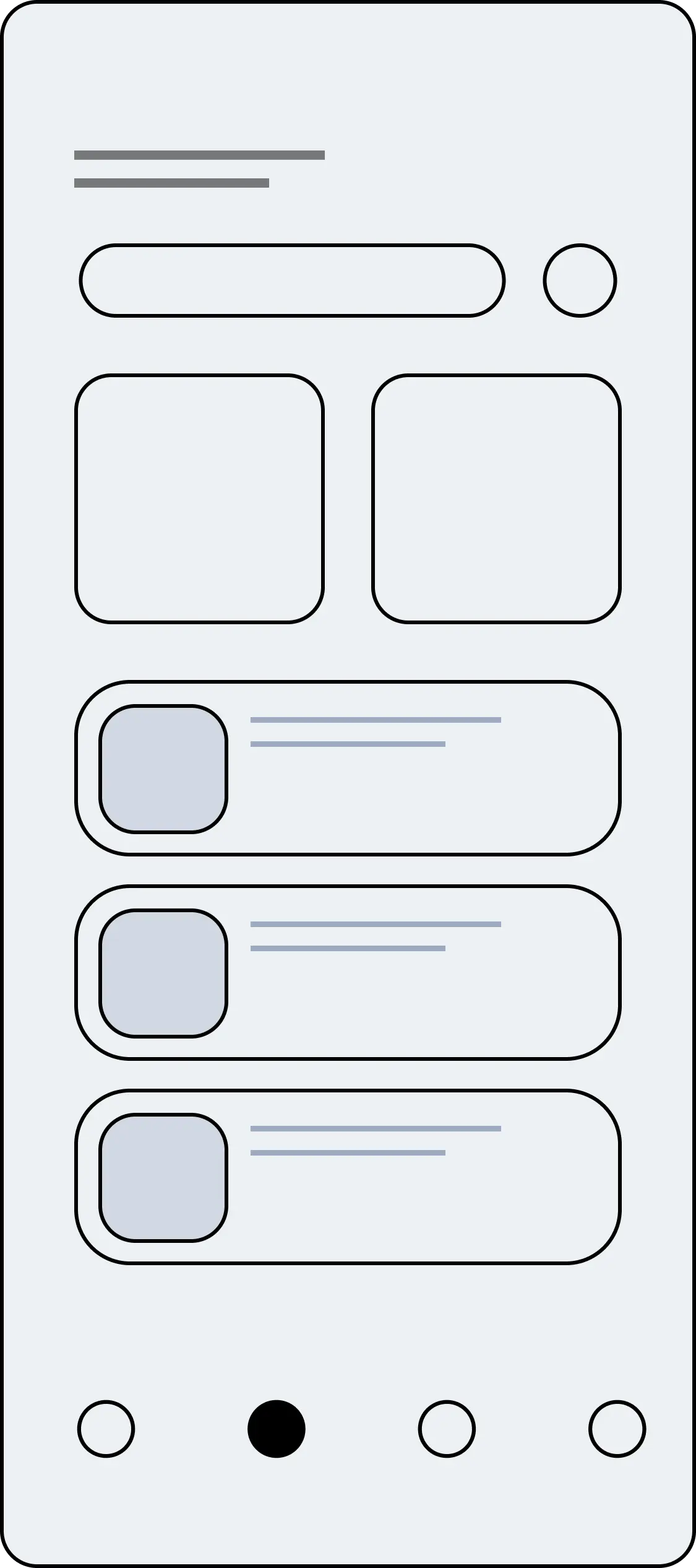
To refine the app’s functionality, I worked through several rounds of wireframing, adding more detail with each version. I started with low-fidelity wireframes to get the basic layout, structure, and key features down. As I moved forward, I kept refining the wireframes, making sure the user interface was smooth and intuitive. With each round, my goal was to ensure everything flowed easily.

Wireframe of a mobile app screen featuring a search bar at the top, two large featured content cards, and a list of smaller content cards below. Navigation icons are displayed at the bottom.
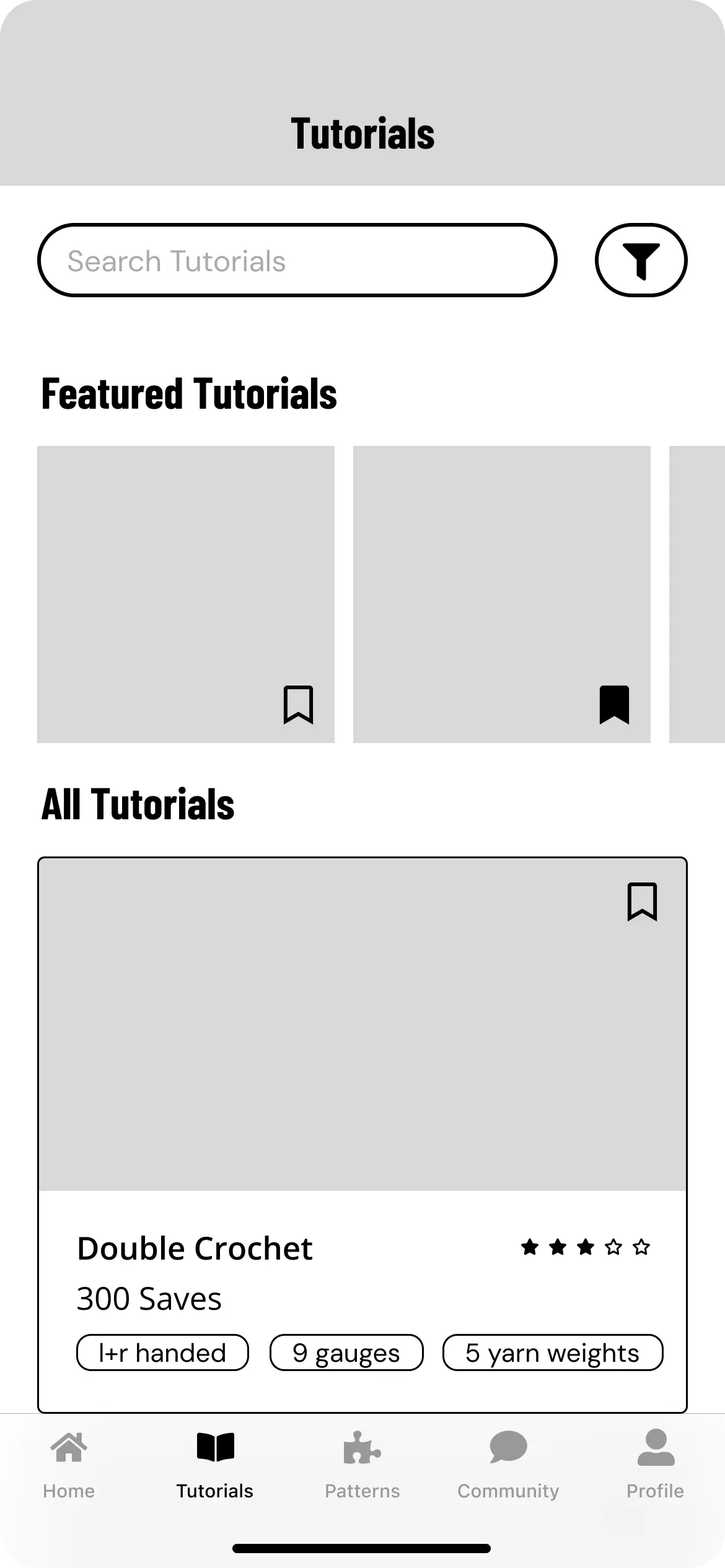
Wireframe of the tutorials screen with a search bar, filter icon, and sections for 'Featured Tutorials' at the top and 'All Tutorials' below. Tutorial cards include save icons, ratings, and tags for attributes like yarn weights.
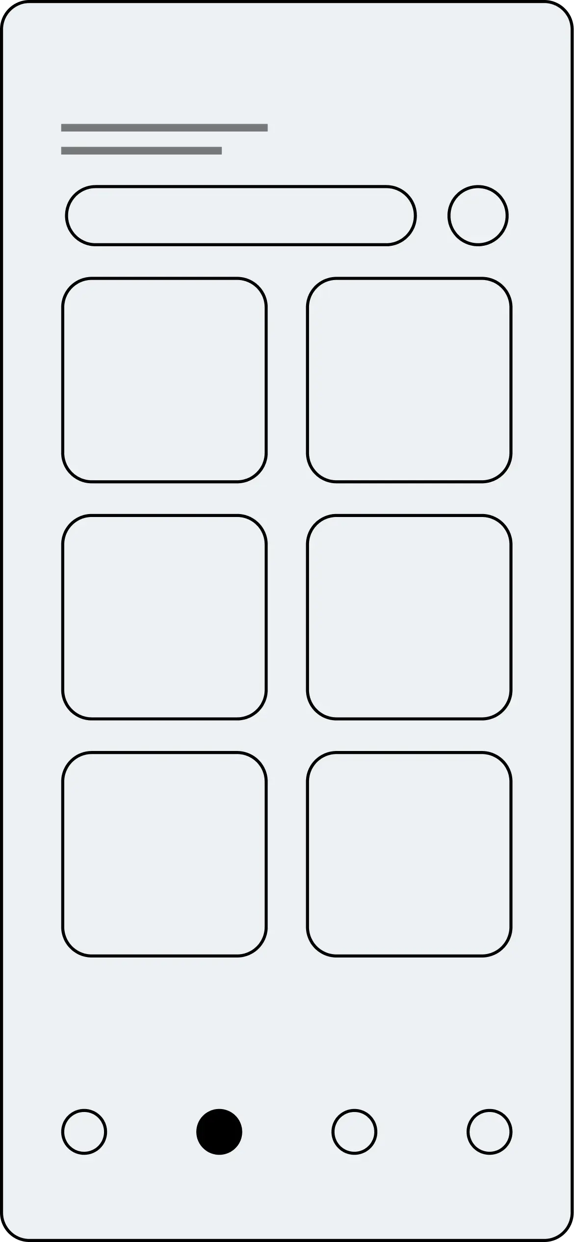
Wireframe of the community screen showcasing a grid layout of cards with placeholders for images. A search bar and profile icon are at the top, with bottom navigation icons included.
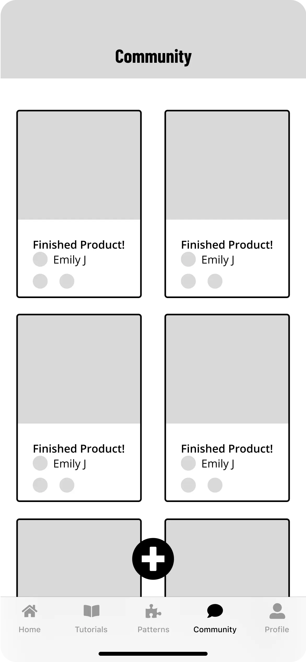
Wireframe of the community screen displaying a grid of cards featuring user posts titled 'Finished Product! Emily J.' A prominent circular 'Add' button is centered at the bottom, alongside navigation icons.

Initial wireframes next to the last round of wireframes

Branding + Design System

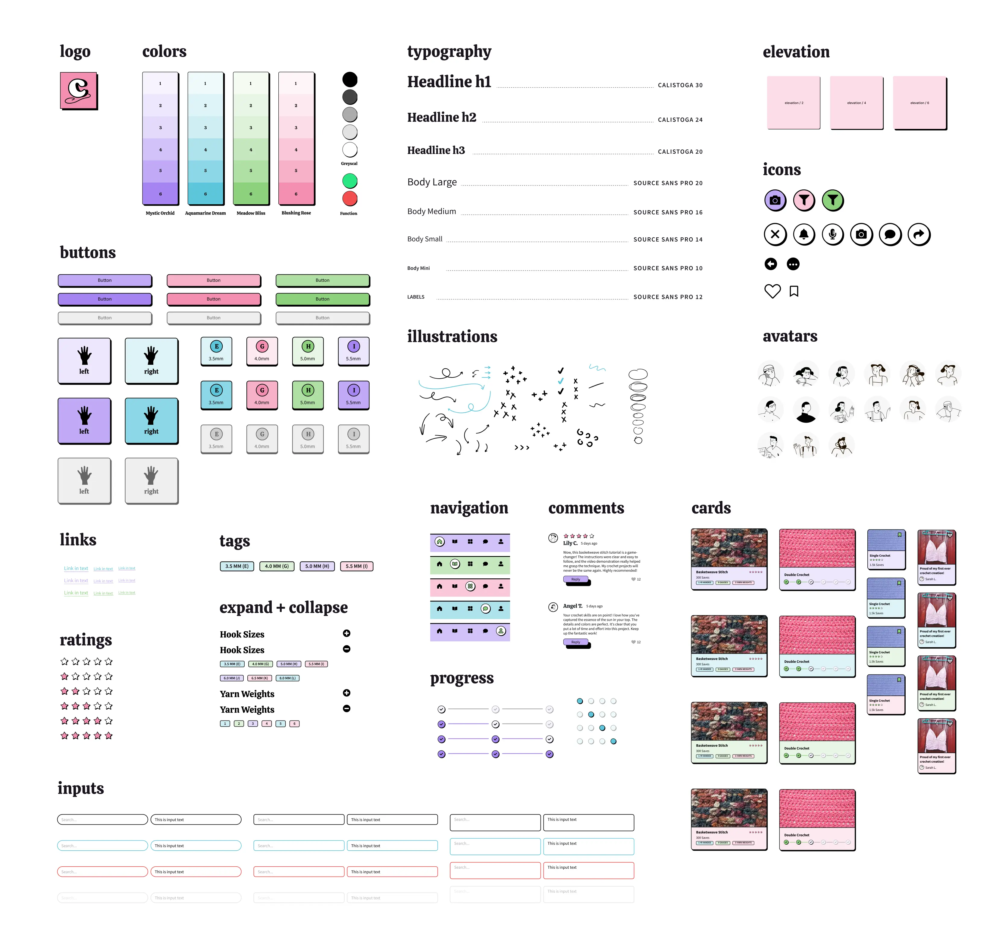
I focused on creating a visual identity that captured the creativity of crocheting while incorporating the Neubrutalist design style. The color palette, inspired by vibrant yarn colors, used playful shades that fit the Neubrutalist aesthetic. For consistency, I developed a design system that defined typography, color usage, iconography, and other visual elements. The goal was to create a unique and fun brand identity.

Design system for the Crochet Companion app, showcasing the logo, color palette, typography styles, buttons, icons, avatars, and various UI components. Includes elements like ratings, progress indicators, tags, input fields, navigation styles, comments, and illustrated accents. Also features card layouts for tutorials and projects, emphasizing consistency and accessibility in design.

The Crochet Companion design system

Visual Design

In one of the final stages of the project, I focused on pulling everything together to create a design that felt cohesive and engaging. Building on the wireframes and design system, I worked on the user interface, paying attention to details like spacing, typography, and visual hierarchy. I used the colors and playful elements from the branding to give the app a lively feel. The Neubrutalist design principles added a modern twist while staying accessible and usable. 

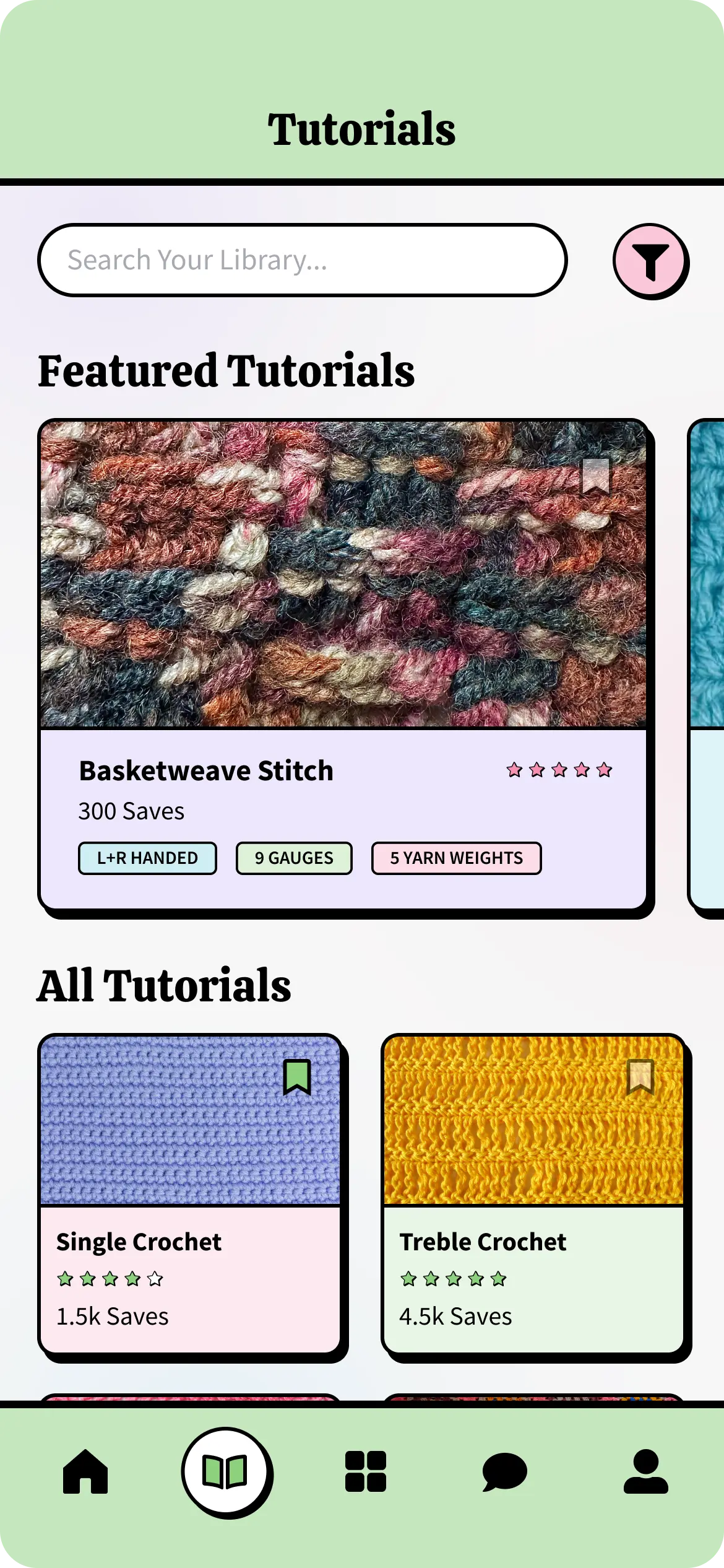
App screen showing the Tutorials section, featuring a search bar, a filter button, and sections for 'Featured Tutorials' and 'All Tutorials.' Tutorial cards include details like the project name, saves, ratings, and attributes such as handedness and yarn weight.
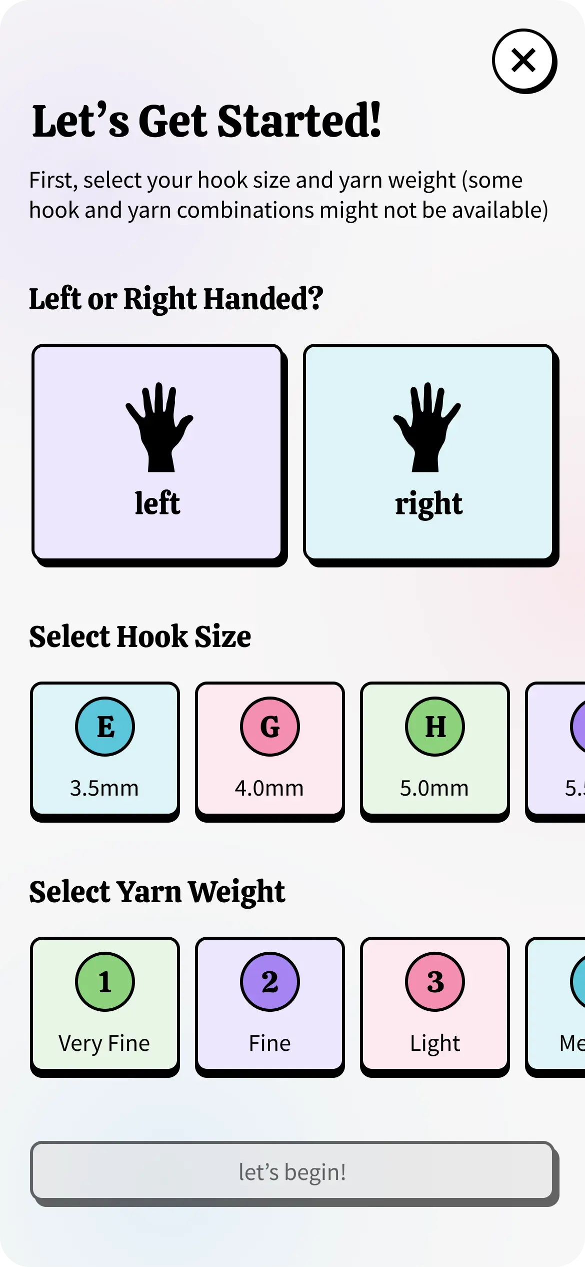
App screen titled 'Let's Get Started!' allowing users to select left or right-handed tutorials, choose hook sizes, and pick yarn weights, with interactive buttons and a 'Let's Begin!' button at the bottom.
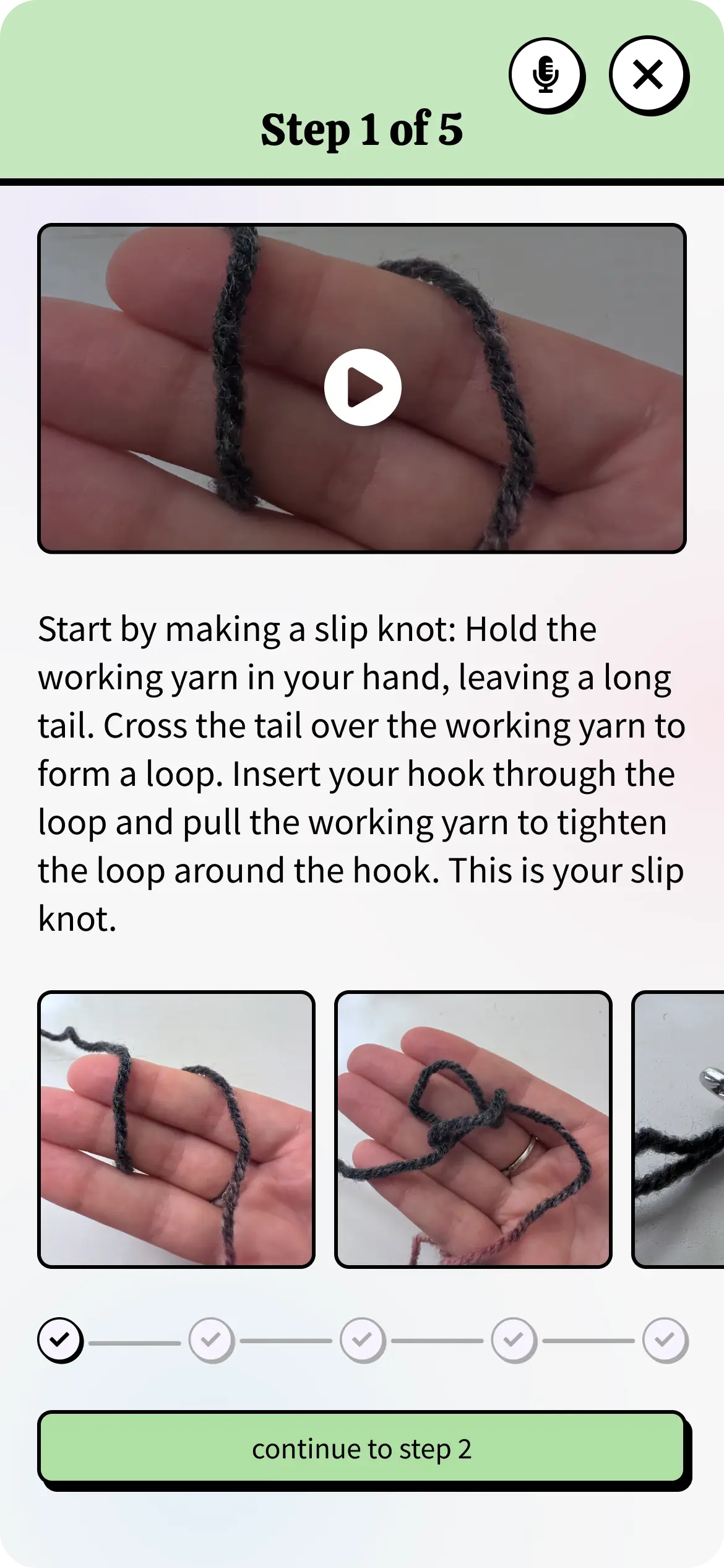
App screen displaying 'Step 1 of 5' in a crochet tutorial, featuring a video demonstration, text instructions for making a slip knot, and additional image thumbnails showing each step.
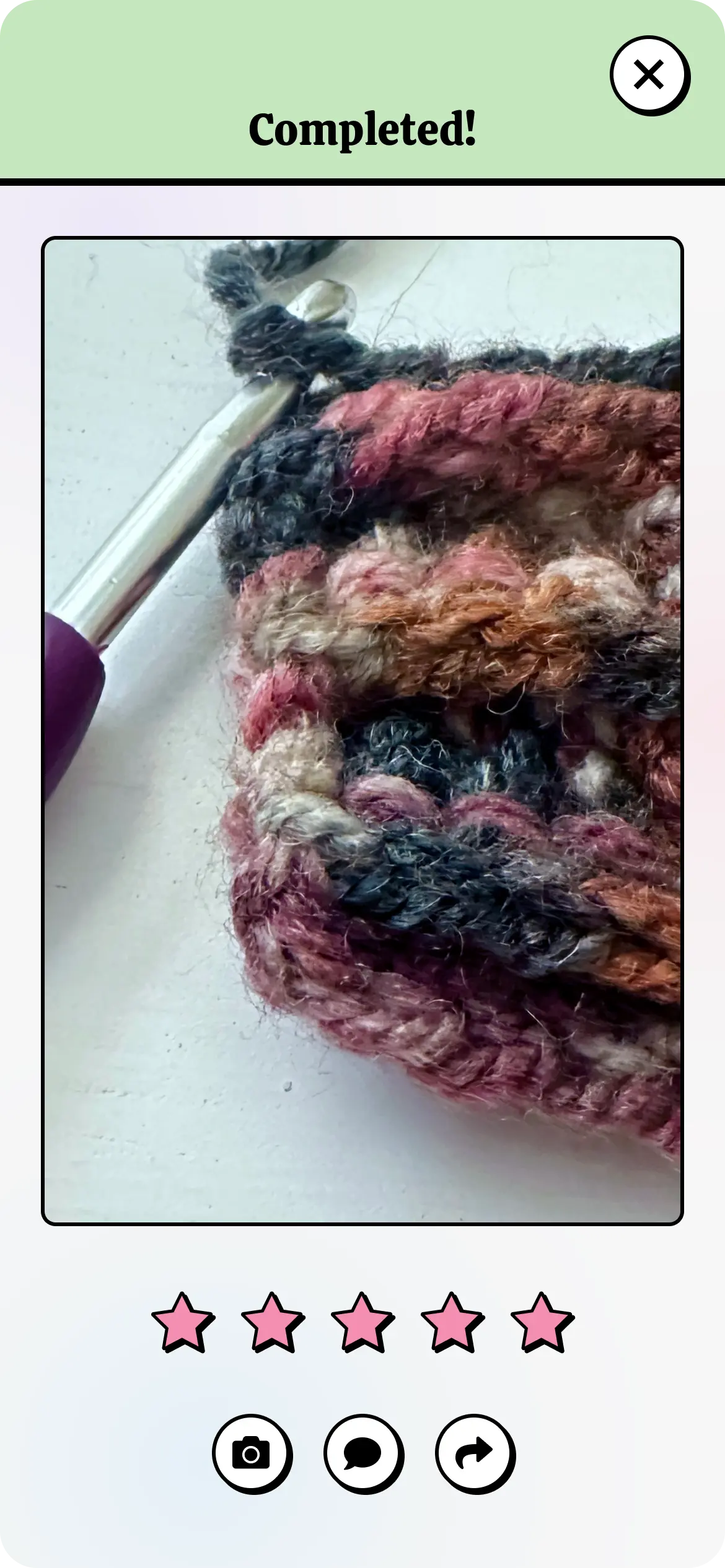
App screen showing the 'Completed!' section of a tutorial with an image of the finished crochet project, options to rate the tutorial, and buttons to capture photos, share progress, or view more projects.

Images from the Tutorial section of the app

Prototyping

I brought my vision to life by creating interactive prototypes of the app. These prototypes allowed me to test the app’s functionality, navigation, and usability. By clicking through the screens, I could see how the app flowed, spot any potential user experience issues, and make the necessary adjustments.

Exploring the Crochet Companion app

Final Thoughts + Next Steps

Creating the Crochet Companion app has been an fun journey where I’ve been able to combine my love for crochet with my product design skills. Throughout the process, I researched existing apps, gathered insights from users, and explored the latest UX trends to build a crochet hub that’s unique and focused on the needs of the community.

​Looking ahead, I’m excited about the possibilities for the app’s future. One idea I’m particularly interested in is integrating augmented reality (AR), so users can virtually compare their finished crochet projects. Another potential feature is offering yarn kits for purchase directly through the app, making it even easier for users to get the materials they need to bring their crochet creations to life.